
PL-100 · Question #127
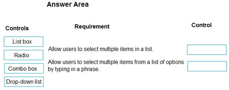
Drag and Drop Question You are designing a canvas app. You need to select user interface controls to include in the app. Which control should you use? To answer, drag the appropriate controls to the…
The correct answer is Component library; Component. This question assesses the candidate's knowledge of Power Apps canvas app user interface controls and their specific functionalities for multiple selection and interactive filtering.
Question
Exhibit
Answer Area
Drag items
Correct arrangement
- Component library
- Component
Explanation
This question assesses the candidate's knowledge of Power Apps canvas app user interface controls and their specific functionalities for multiple selection and interactive filtering.
Approach. To answer correctly, the controls must be matched to their defining functionalities:
- For the requirement 'Allow users to select multiple items in a list.', the 'List box' control is the appropriate choice. A List box control displays a scrollable list of items, and it can be configured to allow users to select multiple items simultaneously, typically by holding down Ctrl or Shift while clicking.
- For the requirement 'Allow users to select multiple items from a list of options by typing in a phrase.', the 'Combo box' control is the correct selection. A Combo box combines a text input field with a drop-down list. This allows users to type in a search phrase to filter the list of options dynamically, and it can also be configured to allow the selection of multiple items from the filtered list. In Power Apps, the Combo box inherently supports searching and multiple selections via its properties like 'AllowMultipleSelection' and 'Search'.
Common mistakes.
- common_mistake. Other controls are incorrect for these specific requirements:
- The 'Radio' control (radio button) is designed for single-selection scenarios where only one option can be chosen from a mutually exclusive group. It does not support multiple selections or typing to filter.
- The 'Drop-down list' control (Dropdown in Power Apps) also primarily allows for a single selection from a collapsed list of options. While it presents a list, it does not natively support multiple selections or typing a phrase to filter the list directly within its interface.
- Incorrectly assigning 'Combo box' to the first requirement would be wrong because while a Combo box can allow multiple selections, its distinguishing feature compared to a List box, especially in this context, is the ability to 'type in a phrase' for filtering. The List box is a more direct fit for simply 'selecting multiple items in a list'.
- Incorrectly assigning 'List box' to the second requirement would be wrong because a List box does not have built-in functionality to filter its options by typing a phrase directly into the control itself. This feature is characteristic of a Combo box.
Concept tested. The core concept being tested is the understanding of different user interface (UI) control types in Power Apps canvas apps, their specific functionalities, and when to use each control based on user interaction requirements (e.g., single vs. multiple selection, search/filter capabilities, and visual presentation).
Topics
Community Discussion
No community discussion yet for this question.