
PL-100 · Question #84
Drag and Drop Question You are developing a Power BI report for a company. The Power BI report must display company performance metrics in Power BI service. The report must include three fields in a…
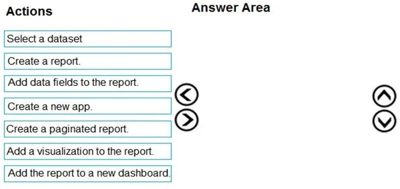
The correct answer is Select a dataset; Create a report.; Add a visualization to the report.; Add data fields to the report. To create a Power BI report with a visualization and data fields, the correct sequence is to first select the dataset, then create the report, add a visualization, and finally add the necessary data fields to that visualization.
Question
Exhibit
Answer Area
Drag items
Correct arrangement
- Select a dataset
- Create a report.
- Add a visualization to the report.
- Add data fields to the report.
Explanation
To create a Power BI report with a visualization and data fields, the correct sequence is to first select the dataset, then create the report, add a visualization, and finally add the necessary data fields to that visualization.
Approach. The scenario requires creating a Power BI report that displays performance metrics using three fields in a visualization, with data already existing in a dataset. The logical sequence to achieve this is:
- Select a dataset: Before you can create a report, you must specify the underlying data source. The question explicitly states, 'The data for the report exists in a dataset.'
- Create a report: Once the dataset is selected or understood, the next step is to initiate the creation of the report canvas itself.
- Add a visualization to the report: Reports display data through visualizations. To show 'performance metrics in a visualization', you must first add a visual object (e.g., bar chart, table) to the report canvas.
- Add data fields to the report: After a visualization is on the canvas, you populate it with data by dragging and dropping the relevant fields from the dataset into the visualization's field wells. The question specifies 'three fields in a visualization'.
This sequence directly addresses the core requirements of creating a report with specific data displayed visually.
Common mistakes.
- common_mistake. Common mistakes include choosing actions that are out of scope for creating the report or are incorrect report types:
- Create a new app: An app is used for distributing a collection of content (reports, dashboards) to a wider audience. It's a step after the report has been created and is ready for sharing, not part of its initial creation.
- Create a paginated report: Paginated reports (formerly RDL reports) are designed for pixel-perfect, print-ready output. The scenario describes a standard interactive Power BI report for display on a large TV screen, which is not a typical use case for a paginated report.
- Add the report to a new dashboard: Dashboards are a way to curate key visuals from one or more reports into a single-pane-of-glass view. While a report can be pinned to a dashboard, creating the report content itself and displaying it doesn't strictly require a dashboard. A report can be viewed directly or in full-screen presentation mode for a TV display. This action comes after the report is created and designed.
- Incorrect ordering of the correct actions, such as adding data fields before adding a visualization, or creating a report before selecting its underlying dataset, would also be wrong because it violates the logical flow of report development.
Concept tested. The underlying technical concept being tested is the fundamental workflow and logical sequence for creating a basic Power BI report in Power BI Service, including understanding the roles of datasets, reports, visualizations, and data fields.
Reference. null
Topics
Community Discussion
No community discussion yet for this question.