
PL-300 · Question #19
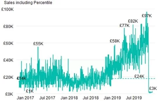
You plan to create the chart shown in the following exhibit. How should you create the dashed horizontal line denoting the 40th percentile of daily sales for the period shown?
The correct answer is C. Add a new percentile line that uses Total Sales as the measure and 40% as the percentile. Power BI's Analytics pane in line and bar charts includes a built-in 'Percentile line' option. You simply select the measure (Total Sales) and specify the percentile (40%), and Power BI automatically calculates and draws the dashed horizontal reference line. Options A and D use…
Question
You plan to create the chart shown in the following exhibit. How should you create the dashed horizontal line denoting the 40th percentile of daily sales for the period shown?
Exhibit
Options
- ACreate a horizontal line that has a fixed value of 24,000.
- BAdd a measure to the visual that uses the following DAX expression.
- CAdd a new percentile line that uses Total Sales as the measure and 40% as the percentile.
- DAdd a measure to the visual that uses the following DAX expression.
How the community answered
(53 responses)- A4% (2)
- B8% (4)
- C87% (46)
- D2% (1)
Explanation
Power BI's Analytics pane in line and bar charts includes a built-in 'Percentile line' option. You simply select the measure (Total Sales) and specify the percentile (40%), and Power BI automatically calculates and draws the dashed horizontal reference line. Options A and D use fixed or custom DAX expressions that would require manually computing the 40th percentile value, which is less dynamic and harder to maintain. Option B similarly uses a DAX measure rather than the native percentile line feature.
Topics
Community Discussion
No community discussion yet for this question.