
PL-300 · Question #116
You need to create a visualization that compares revenue and cost over time. Which type of visualization should you use?
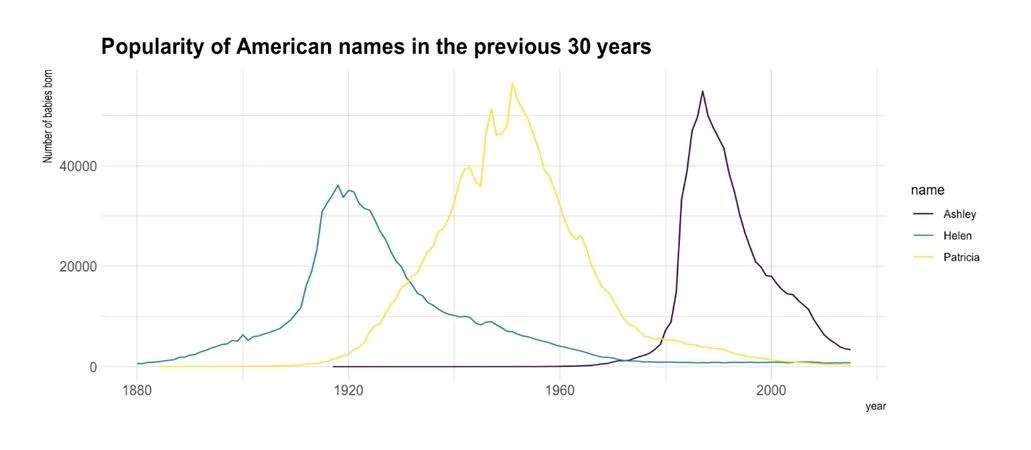
The correct answer is C. line chart. A line chart or line graph displays the evolution of one or several numeric variables. Data points are connected by straight line segments. A line chart is often used to visualize a trend in data over intervals of time – a time series – thus the line is often drawn…
Question
You need to create a visualization that compares revenue and cost over time. Which type of visualization should you use?
Exhibit
Options
- Astacked area chart
- Bdonut chart
- Cline chart
- Dwaterfall chart
How the community answered
(22 responses)- B5% (1)
- C91% (20)
- D5% (1)
Explanation
A line chart or line graph displays the evolution of one or several numeric variables. Data points are connected by straight line segments. A line chart is often used to visualize a trend in data over intervals of time – a time series – thus the line is often drawn chronologically.
Topics
Community Discussion
No community discussion yet for this question.