
PL-300 · Question #18
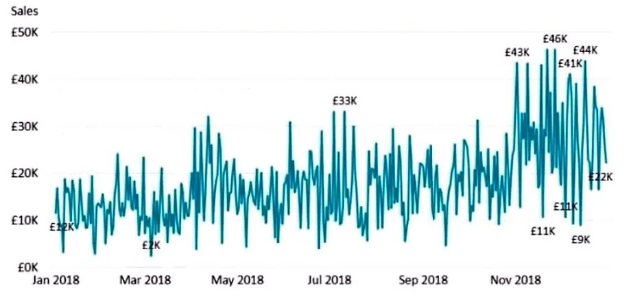
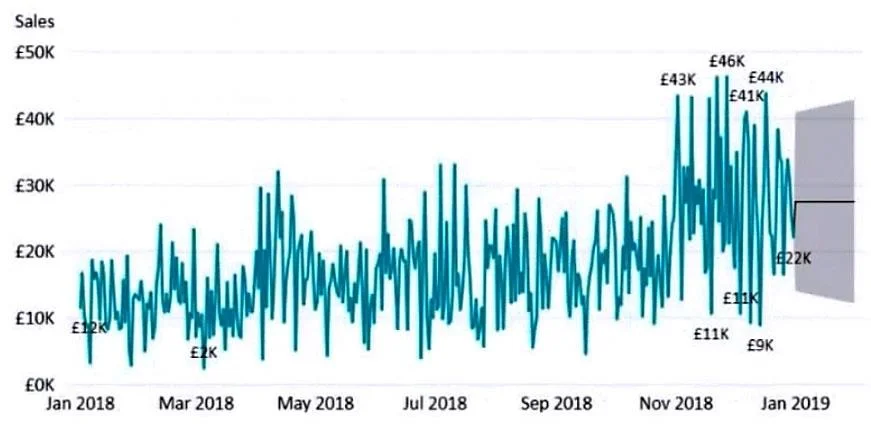
You have the visual shown in the Original exhibit. You need to configure the visual as shown in the Modified exhibit. What should you add to the visual?
The correct answer is C. a forecast. A forecast in Power BI extends a line chart beyond the existing data range to project future values, typically displayed with a shaded confidence interval band. This is what distinguishes the Modified exhibit from the Original: the Modified version shows projected future data…
Question
You have the visual shown in the Original exhibit. You need to configure the visual as shown in the Modified exhibit. What should you add to the visual?
Exhibits
Options
- Aa measure
- Ba trendline
- Ca forecast
- Dan Average line
How the community answered
(45 responses)- A2% (1)
- B11% (5)
- C82% (37)
- D4% (2)
Explanation
A forecast in Power BI extends a line chart beyond the existing data range to project future values, typically displayed with a shaded confidence interval band. This is what distinguishes the Modified exhibit from the Original: the Modified version shows projected future data points. A trendline (B) overlays a statistical line on existing data but does not project into the future. A measure (A) adds a data field, not a visual predictive element. An Average line (D) draws a flat horizontal reference line.
Topics
Community Discussion
No community discussion yet for this question.