
300-915 · Question #46
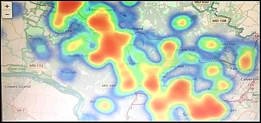
Refer to the exhibit. Which two statements are true? (Choose two.)
The correct answer is A. That is a heatmap projected on top of a geographic map. E. The color blue usually stands for lower values and the color red usually stands for higher values. A is correct because the visualization described is a heatmap - a technique that uses color gradients to represent the intensity or magnitude of values across a surface - overlaid on a geographic map, making it a geospatial heatmap. E is correct because in standard heatmap…
Question
Refer to the exhibit. Which two statements are true? (Choose two.)
Exhibit
Options
- AThat is a heatmap projected on top of a geographic map.
- BThat is a treemap projected on top of a geographic map.
- CThe color red usually stands for lower values and the color blue usually stands for higher values.
- DAnother suitable visualization technique for this image would be line graphs.
- EThe color blue usually stands for lower values and the color red usually stands for higher values.
How the community answered
(37 responses)- A92% (34)
- B3% (1)
- C5% (2)
Explanation
A is correct because the visualization described is a heatmap - a technique that uses color gradients to represent the intensity or magnitude of values across a surface - overlaid on a geographic map, making it a geospatial heatmap. E is correct because in standard heatmap color conventions, blue (cool colors) represents lower intensity or values, while red (warm colors) represents higher intensity or values - think of a "heat" metaphor where red = hot = high.
B is wrong because a treemap displays hierarchical data as nested rectangles, not a color-gradient overlay on geography. C is wrong because it reverses the standard color convention - red is typically high, not low. D is wrong because line graphs show trends over time or continuous data along axes, making them unsuitable for representing geographic spatial density.
Memory tip: Think of a stove burner - red means hot (high values) and blue means cold (low values). This "temperature = heat color" association locks in the correct red/blue mapping for heatmaps every time.
Topics
Community Discussion
No community discussion yet for this question.