
300-915 · Question #47
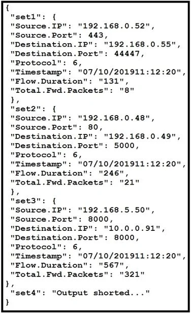
Refer to the exhibit. The code snippet provides information about the packet captures within a network. How can the most used source IP addresses within a specific time be visualized?
The correct answer is B. bar histogram. A bar histogram is correct because it excels at showing frequency/count distributions - making it ideal for visualizing how often each source IP address appears within a specific time window, clearly ranking the most-used IPs side by side. A line graph (A) is wrong because it…
Question
Refer to the exhibit. The code snippet provides information about the packet captures within a network. How can the most used source IP addresses within a specific time be visualized?
Exhibit
Options
- Aline graph
- Bbar histogram
- Cscatter plot
- Dheatmap
How the community answered
(27 responses)- A4% (1)
- B74% (20)
- C7% (2)
- D15% (4)
Explanation
A bar histogram is correct because it excels at showing frequency/count distributions - making it ideal for visualizing how often each source IP address appears within a specific time window, clearly ranking the most-used IPs side by side. A line graph (A) is wrong because it implies continuous change over time, not discrete categorical counts per IP address. A scatter plot (C) shows relationships between two continuous variables, not frequency of categorical items like IP addresses. A heatmap (D) requires two categorical dimensions (e.g., IP vs. time block) - useful for patterns across a matrix, but overkill and less direct than a histogram for simply ranking IPs by usage count.
Memory tip: Think "bar = bar the most popular" - whenever you need to rank who appears most, reach for a bar histogram. If the question says "most used" or "most frequent," histogram is almost always the answer.
Topics
Community Discussion
No community discussion yet for this question.