
300-915 · Question #8
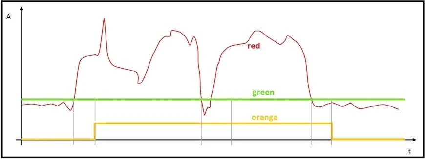
Refer to the exhibit. The graph has been provided by the monitoring team to the IoT Engineer. The red line represents the consumption of energy from an industrial machine. Which two pieces of…
The correct answer is A. The green graph visualizes the mean value of the data points. C. The orange graph visualizes a boolean: power on/off. In IoT monitoring dashboards, it's standard practice to overlay a mean/average line (green) on top of raw sensor data (red) to reveal trends by smoothing out noise - making A correct. The orange graph representing a boolean (power on/off) is also correct (C), as machine state…
Question
Refer to the exhibit. The graph has been provided by the monitoring team to the IoT Engineer. The red line represents the consumption of energy from an industrial machine. Which two pieces of information can be captured? (Choose two.)
Exhibit
Options
- AThe green graph visualizes the mean value of the data points.
- BThe green graph visualizes if the electronic device is not in stand-by mode.
- CThe orange graph visualizes a boolean: power on/off.
- DThe orange graph contains more information than the red graph.
How the community answered
(44 responses)- A73% (32)
- B11% (5)
- D16% (7)
Explanation
In IoT monitoring dashboards, it's standard practice to overlay a mean/average line (green) on top of raw sensor data (red) to reveal trends by smoothing out noise - making A correct. The orange graph representing a boolean (power on/off) is also correct (C), as machine state is commonly encoded as a binary step signal that correlates with when energy spikes begin and end.
B is wrong because the green graph represents a statistical mean, not a binary operational-state indicator like "not in stand-by." D is wrong because a boolean can only hold two values (0 or 1), which is less information than the continuous numerical energy readings in the red graph - a step function always carries less information than a continuous signal.
Memory tip: Think "Green = Gentle average, Orange = On/Off." The smoother the line, the more it represents an aggregate (mean); a flat stepped line jumping between two levels is the visual signature of a boolean.
Topics
Community Discussion
No community discussion yet for this question.