
PL-300 · Question #22
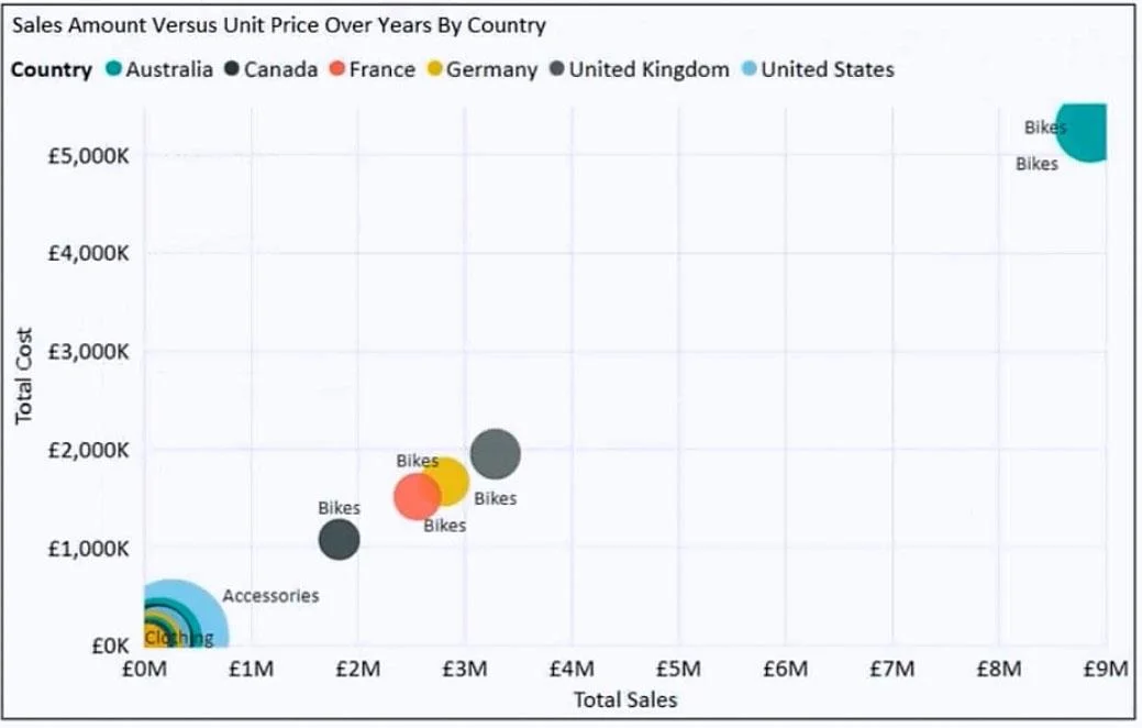
You have the visual shown in the exhibit. You need to show the relationship between Total Cost and Total Sales over time. What should you do?
The correct answer is B. Add a slicer for the year. Adding a year slicer allows users to filter the visual by specific years, enabling them to observe how the relationship between Total Cost and Total Sales changes across different time periods. If the visual is a scatter chart showing Total Cost vs. Total Sales, the slicer…
Question
You have the visual shown in the exhibit. You need to show the relationship between Total Cost and Total Sales over time. What should you do?
Exhibit
Options
- AAdd a play axis.
- BAdd a slicer for the year.
- CFrom the Analytics pane, add an Average line.
- DCreate a DAX measure that calculates year-over-year growth.
How the community answered
(40 responses)- A3% (1)
- B90% (36)
- C3% (1)
- D5% (2)
Explanation
Adding a year slicer allows users to filter the visual by specific years, enabling them to observe how the relationship between Total Cost and Total Sales changes across different time periods. If the visual is a scatter chart showing Total Cost vs. Total Sales, the slicer provides interactive time-based filtering to reveal trends over time. A play axis (A) would animate through time automatically but is a different interaction model. An Average line (C) adds a reference line and doesn't show change over time. A DAX year-over-year measure (D) would add a new metric, not filter the existing relationship view.
Topics
Community Discussion
No community discussion yet for this question.