
PL-300 · Question #439
You have a Power BI semantic model named Model1 that contains two fields named Sales and Quarter. Model1 contains a DAX measure that sums the Sales column. You need to create a report that will…
The correct answer is C. 100% stacked area chart. To create a visual that displays the proportion of sales for each quarter, with segments stacking to 100%, without needing additional DAX measures, a 100% stacked area chart is the appropriate choice among the given options.
Question
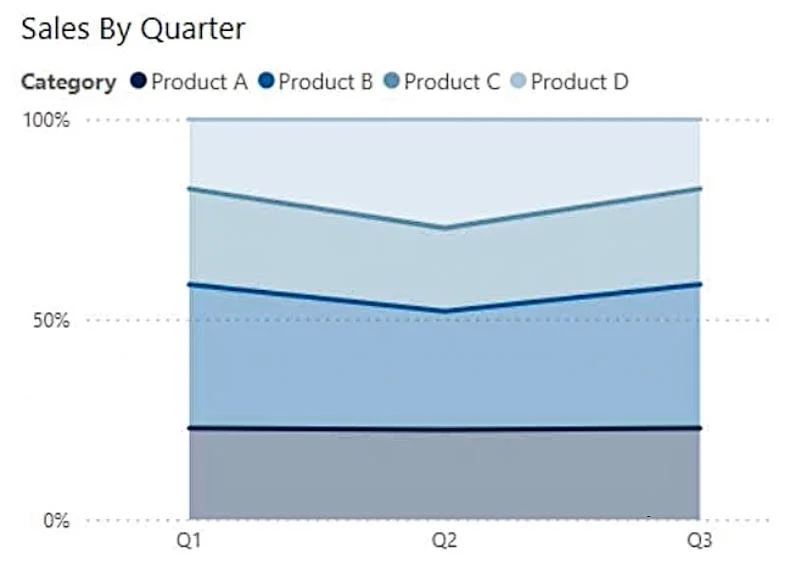
You have a Power BI semantic model named Model1 that contains two fields named Sales and Quarter. Model1 contains a DAX measure that sums the Sales column. You need to create a report that will contain the visual shown in the following exhibit. The solution must NOT require additional DAX measures. Which type of visual should you use?
Exhibit
Options
- Aribbon chart
- Bline chart
- C100% stacked area chart
- Darea chart
How the community answered
(33 responses)- A18% (6)
- B3% (1)
- C73% (24)
- D6% (2)
Why each option
To create a visual that displays the proportion of sales for each quarter, with segments stacking to 100%, without needing additional DAX measures, a 100% stacked area chart is the appropriate choice among the given options.
A ribbon chart shows rank changes over time, emphasizing a specific dimension's ranking, which is not depicted in the exhibit.
A line chart displays trends over time, but typically shows absolute values and does not inherently stack values to 100% or show proportions as seen in the exhibit.
A 100% stacked area chart visualizes the trend of the proportion of each category over time, where the total value for each point on the x-axis (quarters in this case) is normalized to 100%. This aligns with the exhibit's characteristic of showing sales segments summing to 100% for each quarter, without requiring additional DAX for percentages.
An area chart displays the magnitude of change over time, and a stacked area chart sums absolute values, but a regular or standard stacked area chart does not normalize each segment to 100% of the total for each x-axis point.
Concept tested: Choosing appropriate Power BI visuals
Source: https://learn.microsoft.com/en-us/power-bi/visuals/power-bi-visualization-types-for-data#100-stacked-area-charts
Community Discussion
No community discussion yet for this question.