
PL-300 · Question #422
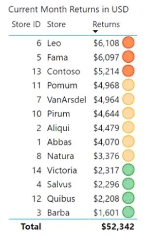
You have a Power BI report that contains the table shown in the following exhibit. The table contains conditional formatting that shows which stores are above, near, or below the monthly quota for…
The correct answer is C. Change the icons to use a different shape for each color. To make a Power BI table with color-coded conditional formatting accessible for users with color vision deficiency, you should change the conditional formatting icons to use a different shape for each color.
Question
You have a Power BI report that contains the table shown in the following exhibit. The table contains conditional formatting that shows which stores are above, near, or below the monthly quota for returns. You need to ensure that the table is accessible to consumers of reports who have color vision deficiency. What should you do?
Exhibit
Options
- AMove the conditional formatting icons to a tooltip report.
- BAdd alt text that lists the values in the table.
- CChange the icons to use a different shape for each color.
- DRemove the icons and use red, yellow, and green background colors instead.
How the community answered
(36 responses)- A3% (1)
- B17% (6)
- C72% (26)
- D8% (3)
Why each option
To make a Power BI table with color-coded conditional formatting accessible for users with color vision deficiency, you should change the conditional formatting icons to use a different shape for each color.
Moving icons to a tooltip report would hide the information initially, making it less accessible and requiring extra interaction rather than improving immediate visual distinction for color-blind users.
While alt text improves screen reader accessibility, it does not directly address the visual accessibility challenge for users with color vision deficiency when they are visually scanning the table.
Changing icons to different shapes in addition to color provides a non-color differentiator, which is crucial for users with color vision deficiency to distinguish between categories like 'above, near, or below quota' without relying solely on color perception.
Removing icons and using only red, yellow, and green background colors would exacerbate the problem for color-blind users, as these colors are commonly indistinguishable for them and lack a non-color differentiator.
Concept tested: Power BI accessibility for color vision deficiency
Source: https://learn.microsoft.com/en-us/power-bi/create-reports/service-accessibility-create-reports#design-for-contrast-and-color-friendly-palettes
Community Discussion
No community discussion yet for this question.