
DY0-001 · Question #40
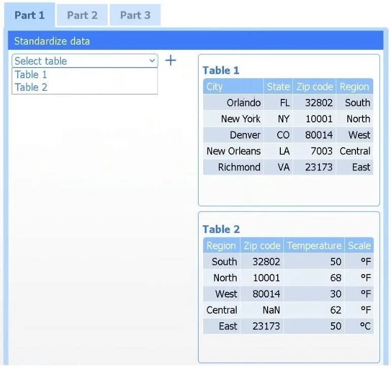
SIMULATION 1 A client has gathered weather data on which regions have high temperatures. The client would like a visualization to gain a better understanding of the data. INSTRUCTIONS Part 1 Review…
Sign in or unlock DY0-001 to reveal the answer and full explanation for question #40. The question stem and answer options stay visible for context.
Question
SIMULATION 1 A client has gathered weather data on which regions have high temperatures. The client would like a visualization to gain a better understanding of the data. INSTRUCTIONS Part 1 Review the charts provided and use the drop-down menu to select the most appropriate way to standardize the data. Part 2 Answer the questions to determine how to create one data set. Part 3 Select the most appropriate visualization based on the data set that represents what the client is looking for. If at any time you would like to bring back the initial state of the simulation, please click the Reset All button. Answer:
Part 1 Select Table 2. Table 2 contains mixed temperature scales (°F and °C) that must be standardized before visualization. Variable: Temperature/scale Action: Correct Value to correct: 50 °C Part 2 Method: Data matching Join variable: Zip code You need to merge the two tables by aligning matching records, which is a data-matching (join) operation, and ZIP code is the shared, uniquely identifying field linking each region’s weather reading to its city. Part 3 Choose the choropleth map (the first option). A choropleth map best shows geographic variation in temperature by coloring each state (or region) according to its recorded value. This lets the client immediately see where the highest and lowest temperatures occur across the U.S. without distracting elements like bubble size or combined chart axes.
Exhibit
Options
- AThe data set consuming too many resources
- BThe data set having insufficient features
- CThe data set having insufficient row observations
- DThe data set not being representative of the population
Unlock DY0-001 to see the answer
You've previewed enough free DY0-001 questions. Unlock DY0-001 for full answers, explanations, the timed quiz mode, progress tracking, and the master PDF. Question stem and options stay visible so you can still see what's on the exam.