CompTIA
DA0-001 · Question #73
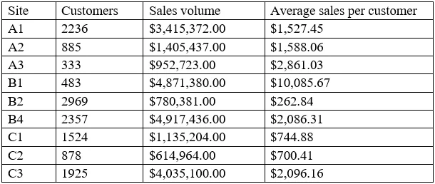
A data analyst is designing a dashboard that will provide a story of sales and determine which site is providing the highest sales volume per customer. The analyst must choose an appropriate chart to
Sign in or unlock DA0-001 to reveal the answer and full explanation for question #73. The question stem and answer options stay visible for context.
Visualization
Question
A data analyst is designing a dashboard that will provide a story of sales and determine which site is providing the highest sales volume per customer. The analyst must choose an appropriate chart to include in the dashboard. The following data is available:
Which of the following types of charts should be considered?
Exhibit
Options
- AInclude a line chart using the site and average sales per customer.
- BInclude a pie chart using the site and sales to average sales per customer.
- CInclude a scatter chart using sales volume and average sales per customer.
- DInclude a column chart using the site and sales to average sales per customer.
Unlock DA0-001 to see the answer
You've previewed enough free DA0-001 questions. Unlock DA0-001 for full answers, explanations, the timed quiz mode, progress tracking, and the master PDF. Question stem and options stay visible so you can still see what's on the exam.
Topics
#Chart selection#Data visualization#Dashboard design#Comparative analysis