
DA0-001 · Question #54
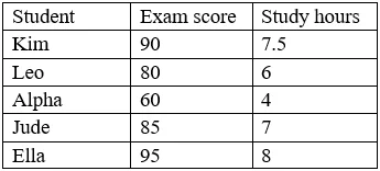
A data analyst was asked to create a chart that shows the relationship between study hours and exam scores for each student using the data sets in the table below: Which of the following charts…
The correct answer is B. A scatter plot. A scatter plot is the correct chart type for visualizing the relationship (correlation) between two continuous numeric variables - in this case, study hours and exam scores. Each student becomes a single data point plotted at coordinates (study hours, exam score), and the…
Question
A data analyst was asked to create a chart that shows the relationship between study hours and exam scores for each student using the data sets in the table below:
Which of the following charts would BEST represent the relationship between the variables?
Exhibit
Options
- AA histogram
- BA scatter plot
- CA heat map
- DA bar chart
How the community answered
(29 responses)- A7% (2)
- B90% (26)
- C3% (1)
Explanation
A scatter plot is the correct chart type for visualizing the relationship (correlation) between two continuous numeric variables - in this case, study hours and exam scores. Each student becomes a single data point plotted at coordinates (study hours, exam score), and the resulting pattern reveals whether a positive, negative, or no correlation exists. A histogram (A) shows frequency distribution of a single variable. A heat map (C) is used for density or magnitude across a matrix. A bar chart (D) compares discrete categories, not continuous variable relationships.
Topics
Community Discussion
No community discussion yet for this question.