CompTIA
DA0-001 · Question #292
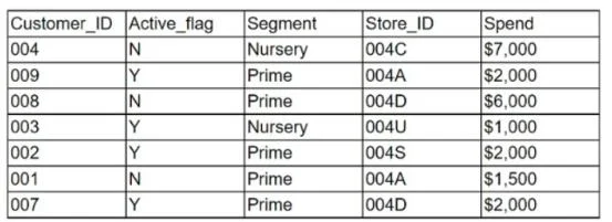
Given the customer table below: Which of the following chart types is the most appropriate to represent the average spending of active customers vs. inactive customers?
Sign in or unlock DA0-001 to reveal the answer and full explanation for question #292. The question stem and answer options stay visible for context.
Visualization
Question
Given the customer table below:
Which of the following chart types is the most appropriate to represent the average spending of active customers vs. inactive customers?
Exhibit
Options
- APie chart
- BHeat graph
- CScatter plot
- DLine chart
Unlock DA0-001 to see the answer
You've previewed enough free DA0-001 questions. Unlock DA0-001 for full answers, explanations, the timed quiz mode, progress tracking, and the master PDF. Question stem and options stay visible so you can still see what's on the exam.
Topics
#Chart types#Data visualization#Categorical data representation