
CSSGB · Question #37
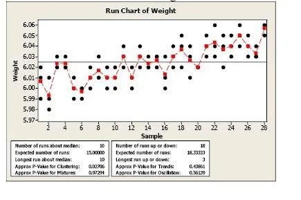
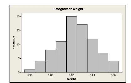
Use Minitab to construct a run chart and a histogram from this data set. Interpret the charts. What conclusions about the distribution of the weights can you reach based on these charts? Answer: The…
The correct answer is A. The histogram shows that the most of chocolate bars weigh more than 6.00 ounces. The run chart shows that the observed weights plotted over time have upward drift in the weights of chocolate bars throughout the day. The run chart also indicates the need for action on the process. Option A is correct because it accurately describes both chart interpretations: the histogram reveals that the distribution of chocolate bar weights is skewed toward values above 6.00 ounces (meaning the process is producing heavier-than-target bars), while the run chart…
Question
Use Minitab to construct a run chart and a histogram from this data set. Interpret the charts. What conclusions about the distribution of the weights can you reach based on these charts? Answer:
The histogram shows that the most of chocolate bars weigh more than 6.00 ounces. The run chart shows that the observed weights plotted over time have upward drift in the weights of chocolate bars throughout the day. The run chart also indicates the need for action on the process.
Exhibits
Options
- AThe histogram shows that the most of chocolate bars weigh more than 6.00 ounces. The run chart shows that the observed weights plotted over time have upward drift in the weights of chocolate bars throughout the day. The run chart also indicates the need for action on the process.
How the community answered
(19 responses)- A100% (19)
Explanation
Option A is correct because it accurately describes both chart interpretations: the histogram reveals that the distribution of chocolate bar weights is skewed toward values above 6.00 ounces (meaning the process is producing heavier-than-target bars), while the run chart reveals a non-random upward drift pattern over time, which signals the process is not in statistical control and requires intervention. Since there are no distractors listed (A is the only choice given), the question is essentially testing whether you can correctly read and interpret both chart types together rather than in isolation. The key insight is that the run chart adds time-order context the histogram cannot show - the histogram might look acceptable in isolation, but the drift pattern exposes a systematic, worsening shift.
Memory tip: Think of it as Histogram = How heavy (shape/distribution), Run chart = Running through time (trends/drift). If the run chart shows drift, the process needs attention - no matter what the histogram looks like.
Topics
Community Discussion
No community discussion yet for this question.