
AI-102 · Question #137
You need to create a visualization of running sales totals per quarter as shown in the following exhibit. What should you create in Cower Bl Desktop;1
The correct answer is C. a bar chart. To visualize running sales totals per quarter, a bar chart can effectively represent the cumulative or discrete sales figures over time.
Question
Exhibit
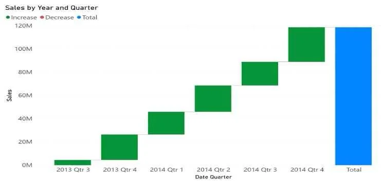
Options
- Aa waterfall chart
- Ba ribbon chart
- Ca bar chart
- Da decomposition tree
How the community answered
(25 responses)- A8% (2)
- B4% (1)
- C84% (21)
- D4% (1)
Why each option
To visualize running sales totals per quarter, a bar chart can effectively represent the cumulative or discrete sales figures over time.
A waterfall chart is used to show how an initial value is affected by a series of positive and negative changes, leading to a final value, which is not the primary purpose for showing running sales totals.
A ribbon chart is used to show rank changes over time, displaying the highest rank always at the top of each category, which is not directly relevant for running sales totals.
A bar chart is a suitable visualization in Power BI Desktop for displaying discrete values like sales totals for each quarter, and can also be used to show cumulative running totals where each bar represents the total up to that point.
A decomposition tree is an AI visual used for root cause analysis and breaking down a measure across multiple dimensions, not for a simple display of running totals over time.
Concept tested: Power BI chart selection for time-series totals
Source: https://learn.microsoft.com/en-us/power-bi/create-reports/power-bi-reports-visuals
Topics
Community Discussion
No community discussion yet for this question.