
300-915 · Question #21
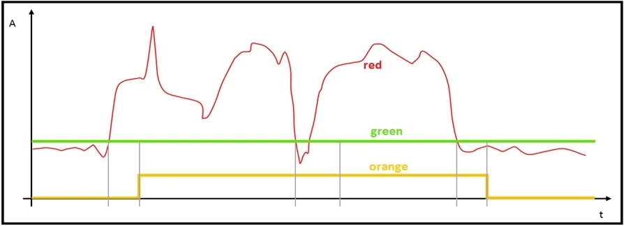
Refer to the exhibit. The red line represents the energy consumption of an industrial machine. Which two statements about the graphs are true? (Choose two.)
The correct answer is B. The red graph contains the raw data points. C. The green graph is the mean value of the data points. Options B and C are correct because in standard data visualization for industrial monitoring, the raw/unprocessed sensor readings are plotted directly as the red line, while the green line represents the computed mean (average) of those readings - a common pattern in analytics…
Question
Refer to the exhibit. The red line represents the energy consumption of an industrial machine. Which two statements about the graphs are true? (Choose two.)
Exhibit
Options
- AThe orange graph is expected to drop to zero for a brief period around the midpoint on the x axis.
- BThe red graph contains the raw data points.
- CThe green graph is the mean value of the data points.
- DThe green graph does not give us any valuable information.
- EThe orange graph has three values on the y-axis.
How the community answered
(30 responses)- A7% (2)
- B77% (23)
- D13% (4)
- E3% (1)
Explanation
Options B and C are correct because in standard data visualization for industrial monitoring, the raw/unprocessed sensor readings are plotted directly as the red line, while the green line represents the computed mean (average) of those readings - a common pattern in analytics dashboards where a smooth horizontal or slowly-changing line overlays noisy data to show the central tendency.
Why the distractors are wrong:
- A is false - a moving average or trend line (orange) smooths over fluctuations but would not drop to zero unless the underlying data did; there's no basis for expecting a zero-crossing at the midpoint.
- D is the opposite of true - the mean (green) is one of the most informative summary statistics, directly contradicting C.
- E is false - a continuous line graph has a continuous y-axis scale, not just three discrete values.
Memory tip: Think Red = Raw and Green = General average. Raw data is always the noisiest, most jagged line; the mean is the smoothest summary line sitting through the middle of the data cloud.
Topics
Community Discussion
No community discussion yet for this question.