
TDS-C01 · Question #127
You create a dual axis chart that shows sales and profit over time. What should you do to distinguish sales from profit? (Choose two.)
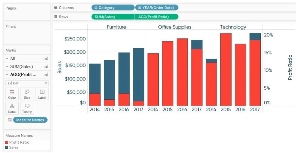
The correct answer is B. Change the mark types of sales and profit. D. Change the color of sales and profit. In a dual axis chart, changing mark types (e.g., making sales a bar and profit a line) gives each measure a visually distinct shape, while changing colors applies different hues so viewers can instantly differentiate the two measures - both are standard, non-destructive ways to…
Question
You create a dual axis chart that shows sales and profit over time. What should you do to distinguish sales from profit? (Choose two.)
Exhibit
Options
- AAdjust the time frame displayed.
- BChange the mark types of sales and profit.
- CAdjust the aggregations for sales and profit to be different.
- DChange the color of sales and profit.
How the community answered
(55 responses)- A4% (2)
- B93% (51)
- C4% (2)
Explanation
In a dual axis chart, changing mark types (e.g., making sales a bar and profit a line) gives each measure a visually distinct shape, while changing colors applies different hues so viewers can instantly differentiate the two measures - both are standard, non-destructive ways to add visual distinction.
Why the distractors are wrong:
- A (Adjust time frame): Changing the time range affects what data is shown, not how the two measures are distinguished from each other.
- C (Adjust aggregations): Using different aggregations (e.g., SUM vs. AVG) changes the values being compared, which distorts the analysis rather than aiding visual clarity.
Memory tip: Think "shape and color" - the two most fundamental visual encodings in chart design. If you need to tell two things apart on the same chart, you change how they look (mark type = shape, color = hue), not how the data is calculated or filtered.
Topics
Community Discussion
No community discussion yet for this question.